



No CSS property makes a page rank. There is no seo: true declaration, and search engines do not read your class names.
What CSS does is decide three things that matter enormously: whether a crawler can render your page at all, how fast it paints, and whether the content a reader sees in a given order is the same order a machine reads it in.
That third one is the part almost nobody discusses, and it’s the most interesting.
So the honest version of this topic isn’t “CSS rules that boost rankings.” It’s: CSS is the layer where a technically sound page quietly becomes a slow, unstable, or unreadable one.
Here’s what this guide covers:
- The mechanism: the four channels through which CSS reaches SEO
- Nine rules: the ones with measurable impact, with code
- DOM order: why your visual layout and your machine-readable layout can disagree
- Five myths: widely repeated CSS-SEO advice that is simply wrong
Our running example is Copperpot, a recipe site with about 900 published pages, a custom theme, and a display-ad partner. Their LCP sits at 4.1 seconds and their CLS at 0.28 — both failing.
Every rule below fixes something real on that site.
Does CSS Affect SEO?
CSS affects SEO indirectly, through four channels: whether search engines can render the page, how the page performs on Core Web Vitals, whether content is accessible on mobile, and what order machines encounter your content in.
It is not a direct ranking factor. Google does not evaluate your stylesheet for quality, and no selector, property, or naming convention improves rankings on its own.
But the indirect route is not a small route.
A render-blocking stylesheet can add 800 milliseconds to LCP on a mobile connection. A missing aspect-ratio can push CLS past the failure threshold. A blocked stylesheet can stop Google understanding your layout entirely.
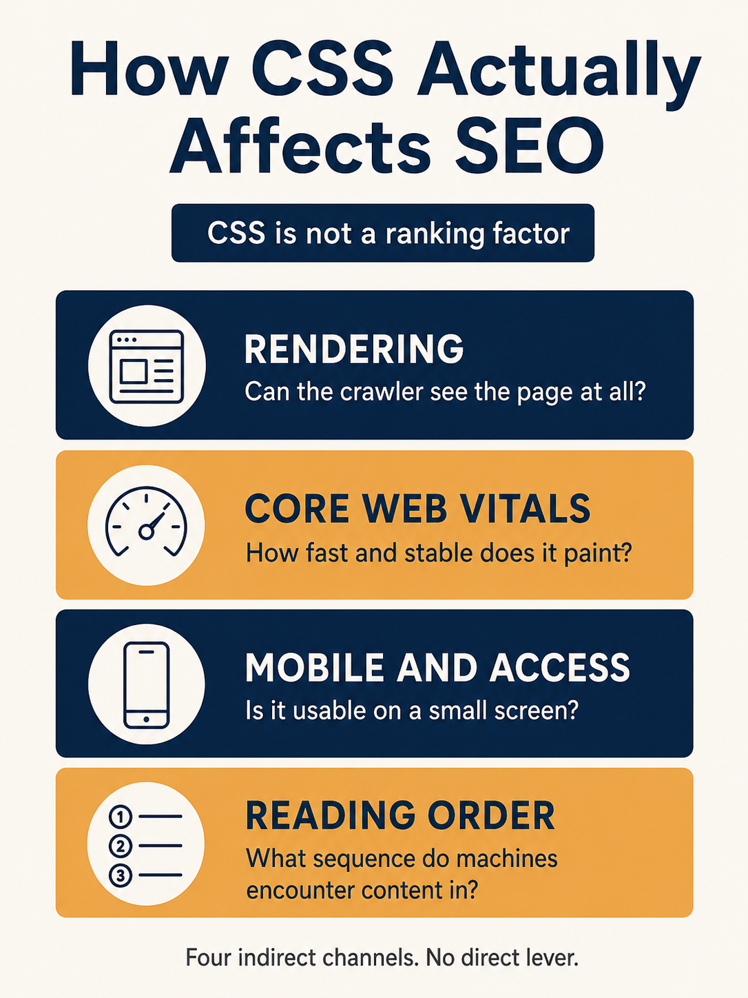
Work through the rules in that order. Rendering first, because nothing else matters if the page can’t be seen.
1. Never Block Stylesheets in robots.txt
Google renders pages with a headless browser. It fetches your CSS the same way a visitor does.
Block that fetch and Google evaluates an unstyled page — which means it cannot judge mobile-friendliness, cannot see what’s above the fold, and cannot tell which content you’ve de-emphasised.
Check your /robots.txt for anything like this:
Disallow: /wp-content/themes/
Disallow: /assets/css/
Disallow: /*.css$
All three are mistakes. Remove them.
Then verify in Search Console: run URL Inspection on a key page, click View Crawled Page, and check the Screenshot tab. If the rendered page looks unstyled, you have a blocked resource.
This is the cheapest fix in the entire guide and still one of the most common faults on older sites.
Note
The same applies to CDN subdomains. If your stylesheets are served from cdn.yoursite.com, that host needs its own permissive robots.txt. A blocked CDN produces the identical failure.
2. Inline Critical CSS, Defer the Rest
An external stylesheet in <head> is render-blocking by default. The browser will not paint anything until it downloads and parses that file.
Which means your Largest Contentful Paint waits on a CSS request that has nothing to do with the largest element.
Here’s what that looks like when you measure it:
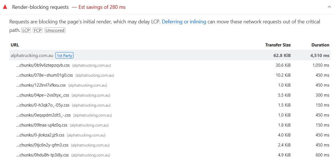
Eleven stylesheets, 62.8 KB, and 280 milliseconds of delay before anything appears on screen.
The fix has two halves.
Inline the styles needed for above-the-fold content directly in a <style> block. Then load everything else without blocking:
<style>
  /* above-the-fold styles only */
  body { margin: 0; font-family: system-ui, sans-serif; }
  .site-header { padding: 1rem; }
  .hero { min-height: 60vh; }
</style>

<link rel="stylesheet" href="/main.css" media="print" onload="this.media='all'">
<noscript><link rel="stylesheet" href="/main.css"></noscript>
The media="print" trick makes the browser fetch the file at low priority without blocking render, then swaps it to all once loaded.
Keep the inlined block small — roughly 14 KB is the usual guidance, since that’s about what fits in the first network round trip. Inline more and you inflate the HTML, which delays the response the technique was supposed to speed up.
Copperpot’s theme loaded three blocking stylesheets totalling 210 KB. Inlining 9 KB of critical styles and deferring the rest took roughly 600 ms off mobile LCP.
Tip
Chrome’s own documentation notes that inlining is an advanced technique and most sites can hit their targets without it. Try removing unused CSS first (Rule 8). If that gets you under 2.5 seconds, stop there.
3. Set font-display on Every Web Font
A web font without font-display blocks text rendering while it downloads. Users see nothing where your headline should be — the flash of invisible text, or FOIT.
Invisible text can’t be the Largest Contentful Paint, so LCP waits for the font.
@font-face {
  font-family: 'Poppins';
  src: url('/fonts/poppins.woff2') format('woff2');
  font-display: swap;
  font-weight: 400 700;
}
swap shows a fallback font immediately and replaces it when the real one arrives. That fixes LCP.
But it introduces a second problem: when the swap happens, the new font has different metrics, text reflows, and you get a layout shift.
Fix that by matching the fallback’s metrics to the real font:
@font-face {
  font-family: 'Poppins Fallback';
  src: local('Arial');
  size-adjust: 106%;
  ascent-override: 92%;
  descent-override: 24%;
}

body { font-family: 'Poppins', 'Poppins Fallback', sans-serif; }
Two other things worth doing while you’re here. Preload the font files used above the fold, and subset your fonts to the characters you actually use — a full Latin-Extended file often carries glyphs no page on your site will ever render.
If you’d rather avoid the swap shift entirely, font-display: optional uses the fallback permanently when the font doesn’t arrive fast enough. No shift, at the cost of some users never seeing your typeface.
4. Reserve Space for Everything That Loads Late
Cumulative Layout Shift comes from elements that arrive after first paint and push existing content down.
The rule is simple: if something will occupy space, declare that space before it exists.
/* images and video */
img, video { max-width: 100%; height: auto; }

/* embeds and iframes */
.video-embed { aspect-ratio: 16 / 9; width: 100%; }

/* ad slots — the biggest CLS source on content sites */
.ad-slot-leaderboard { min-height: 250px; }

/* anything injected by script */
.newsletter-inline { min-height: 180px; }
For images, the most reliable approach is still width and height attributes in the HTML plus height: auto in CSS. The browser derives the aspect ratio from the attributes and reserves the box immediately.
Ad slots deserve special attention, because ad networks inject content asynchronously into containers with no dimensions. Set a min-height matching the smallest creative the slot serves.
Copperpot’s CLS was 0.28. Reserving space on three ad slots and the recipe card image took it to 0.04.
5. Keep DOM Order and Visual Order Aligned
This is the rule nobody writes about, and the one most likely to be quietly costing you.
CSS can reorder content visually without changing the underlying HTML. Flexbox order, row-reverse, grid placement, and absolute positioning all do it.
The problem is that anything reading your page sequentially — a screen reader, an accessibility audit, a system extracting passages for an AI answer — follows the DOM, not the visual layout.
So the two can disagree.
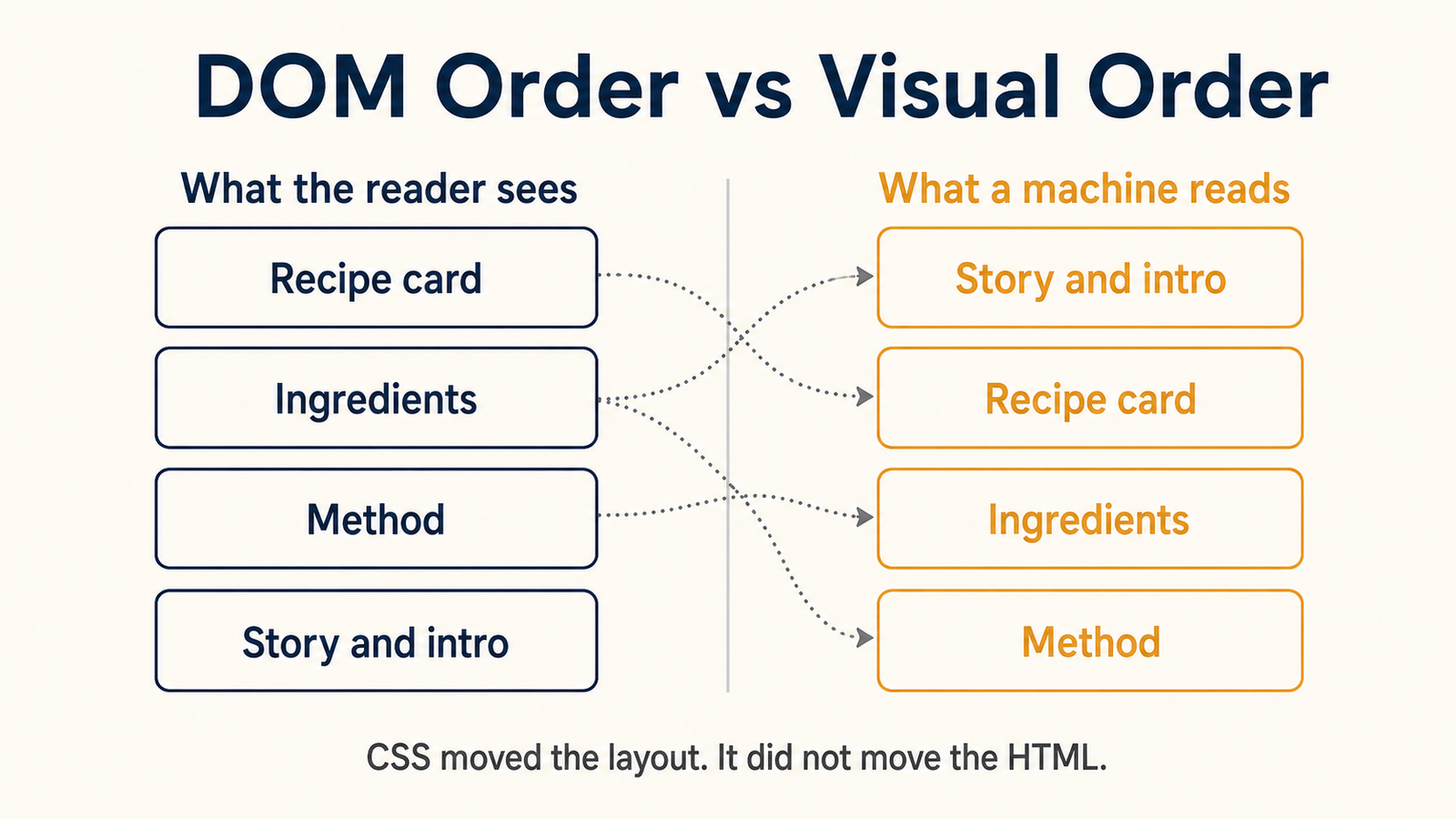
Copperpot’s template is the classic case. The recipe card appears at the top of the page visually, because that’s what readers want. In the HTML it sits after 800 words of introduction, because the theme uses order: -1 to float it up.
A reader gets the answer immediately. A system reading the document linearly wades through the story first.
Here’s the pattern to avoid:
/* moves the card up visually, leaves it late in the DOM */
.recipe-card { order: -1; }
And the fix — move it in the HTML instead, then use CSS only for presentation:
<article>
  <div class="recipe-card">…</div>
  <section class="intro">…</section>
</article>
Two practical checks. Tab through the page with your keyboard: if focus jumps around unpredictably, DOM and visual order have diverged. And disable CSS entirely — most browsers can do this from DevTools — then read the page top to bottom. That unstyled sequence is what a machine encounters.
Some reordering is fine and unavoidable, particularly for responsive layouts where a sidebar moves below content on mobile. The rule isn’t “never reorder.” It’s: never let the most important content end up last in the DOM because CSS is compensating.
Note
This is also a WCAG requirement. Success criterion 1.3.2, Meaningful Sequence, asks that reading order be programmatically determinable. Fixing it for accessibility fixes it for extraction at the same time.
6. Be Careful What You Hide With display: none
Content hidden with CSS is still in the DOM, so Google can crawl and index it. Tabs, accordions, and FAQ toggles are legitimate patterns and Google has said so repeatedly.
The problems are elsewhere.
Content injected by JavaScript on click is not in the DOM until the click happens. Google’s renderer doesn’t click things. If your FAQ answers only exist after a user interaction, they may not be indexed at all.
The test: view the rendered HTML, not the source. In DevTools, open the Elements panel and search for a phrase from a collapsed answer. If it’s there before you click, you’re fine.
Hiding text to deceive is a different matter entirely. White text on white backgrounds, font-size: 0, text-indent: -9999px on keyword blocks, or off-screen positioning of content meant only for crawlers are spam policy violations, not clever optimisation.
The line is intent. Hiding for interface design is fine. Hiding to show search engines something you don’t show users is not.
Hiding your answer in a collapsed block sits in between. It’s indexable, but if the direct answer to the page’s main question only appears after a click, you’ve made it harder to extract. Keep the answer visible; collapse the elaboration.
7. Use content-visibility for Long Pages
content-visibility: auto tells the browser to skip layout and paint for sections outside the viewport until the user scrolls near them.
On a 900-page recipe archive with long comment threads, that’s a meaningful rendering saving.
.comment-thread,
.related-recipes {
  content-visibility: auto;
  contain-intrinsic-size: auto 800px;
}
Two things to get right.
contain-intrinsic-size is not optional. Without it the browser treats the skipped section as zero-height, which breaks scrollbar length and can cause shifts as the user scrolls. Give it a rough estimate of the real height.
And never use content-visibility: hidden for content you want indexed or reachable. Unlike auto, it removes the subtree from rendering and the accessibility tree until you change it in script.
Apply it below the fold only. Using it on above-the-fold content delays exactly the paint you’re trying to speed up.
8. Ship Only the CSS the Template Uses
Most sites load one stylesheet containing every rule for every template. A blog post downloads the checkout styles. A product page downloads the blog typography.
Find out how bad it is in about thirty seconds.
Open Chrome DevTools, press Cmd/Ctrl + Shift + P, run Show Coverage, then reload the page. The panel reports how many bytes of each stylesheet went unused.
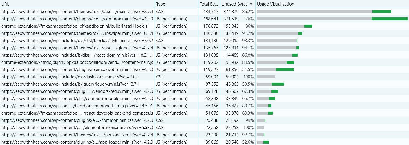
Anything above 60% unused is worth acting on. Rows sitting at 98% or 100% are files the page downloads and never applies at all.
Three things to do about it:
- Split by template: load a base stylesheet everywhere, and template-specific files only where needed
- Remove dead rules: most sites carry styles for components deleted years ago
- Audit your plugins: on WordPress especially, plugins enqueue stylesheets on every page regardless of whether their component appears
That last one is the biggest win on most WordPress sites. A slider plugin, a contact form, and a social sharing bar can easily add 100 KB of CSS to pages that use none of them.
9. Meet the Mobile and Accessibility Minimums
Google indexes the mobile version of your page. These are the CSS-level baselines.
/* readable body text without zooming */
body { font-size: 16px; line-height: 1.5; }

/* tap targets large enough to hit */
a, button { min-height: 24px; min-width: 24px; }

/* never disable zoom */
/* and never ship: user-scalable=no */

/* prevent horizontal overflow */
html, body { overflow-x: hidden; }
img, table, pre { max-width: 100%; }
Contrast matters too. WCAG asks for a 4.5:1 ratio for normal text and 3:1 for large text. DevTools shows the computed ratio when you inspect any text element.
None of this is glamorous, and none of it will show up in a case study. But failing mobile usability affects the version of your page Google actually ranks.
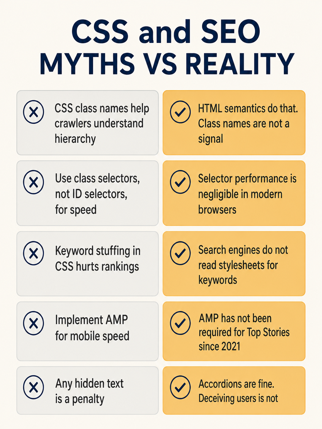
Five CSS and SEO Myths Worth Retiring
Search this topic and you’ll find these repeated across most of the first page. All five are wrong.
Two of those deserve a sentence more.
Selector performance was a real concern in 2009. Modern browsers evaluate selectors in microseconds, and the difference between an ID and a class selector is invisible next to a 200 KB stylesheet. Optimise file size, not selector syntax.
Class names are read by nobody except developers. Naming a div .seo-optimized-heading does exactly nothing. Use <h2>, which does.
How to Audit Your CSS for SEO in 20 Minutes
Five checks, in priority order.
- Check robots.txt for any rule blocking CSS paths, then confirm with URL Inspection’s rendered screenshot
- Run PageSpeed Insights on one URL per template and read the “Render-blocking requests” and layout shift diagnostics
- Run DevTools Coverage and note the unused percentage on your largest stylesheet
- Disable CSS and read one important page top to bottom to check DOM order
- Search the rendered HTML for a phrase inside a collapsed accordion to confirm it’s in the DOM
Fix in that order too. A blocked stylesheet is a rendering failure; unused CSS is an efficiency problem. They are not the same severity.
CSS and SEO FAQs
Is CSS a ranking factor?
No. Search engines do not evaluate stylesheets for quality, and no CSS property influences rankings directly.
CSS affects rankings indirectly, by determining whether a page can be rendered, how it scores on Core Web Vitals, and whether it’s usable on mobile. Those are ranking inputs. The CSS itself is not.
Does inline CSS hurt SEO?
Not by itself. A small block of inlined critical CSS in <head> is a recommended performance technique.
What causes problems is inline style attributes scattered through the body, which can’t be cached and inflate every page’s HTML. That’s a maintainability and page-weight issue rather than an SEO penalty.
Does hidden text in CSS get indexed?
Content hidden with display: none remains in the DOM and is generally crawled and indexed. Tabs and accordions are accepted interface patterns.
The exceptions are content injected by JavaScript only after a click, which may never enter the rendered DOM, and text hidden specifically to show search engines something users don’t see, which violates spam policies.
How much CSS is too much?
There’s no fixed threshold, but two signals are reliable. If DevTools Coverage reports more than 60% unused on a page, you’re shipping too much. And if PageSpeed Insights flags render-blocking requests with savings above 300 ms, it’s costing you measurable LCP.
Total size matters less than what blocks the first paint.
Do CSS animations affect Core Web Vitals?
They can. Animations that change layout properties like width, height, top, or margin force the browser to recalculate layout on every frame, which affects responsiveness.
Animate transform and opacity instead. Both run on the compositor and don’t trigger layout.
Start With the Two That Take Five Minutes
Most of this guide is engineering work. Two things aren’t.
Open /robots.txt and confirm nothing blocks your CSS. Then run DevTools Coverage on your busiest template and look at the unused percentage.
The first is a rendering failure if it’s wrong, and it takes one line to fix. The second tells you within thirty seconds whether the rest of this guide is worth your afternoon.
If Coverage says 20% unused, your CSS is fine and your performance problem is somewhere else. If it says 85%, you’ve found it.

